Design
YouTube pushing Shorts
13 August 2024
Recently, I was flashed with a full-screen modal on the YouTube app asking me to create Shorts. It was weird.
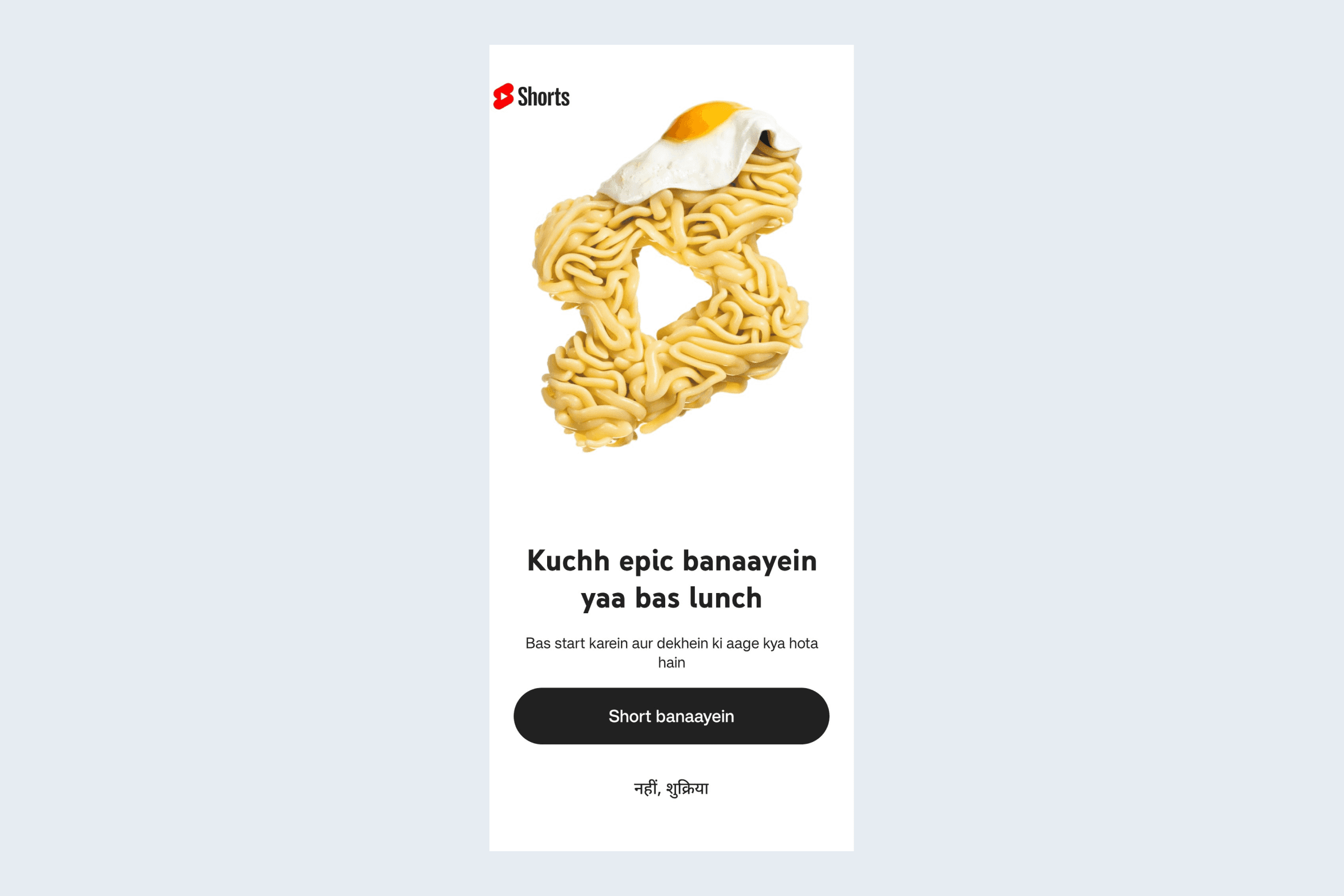
More than that, the screen was poorly-designed—a missed opportunity to make a good impression about creating Shorts on YouTube. The three main problems that I see upfront on the screen are:
Absolutely irrelevant illustration, especially for the Indian audience.
Poor copywriting. The heading doesn't make a point and confuses even more when coupled with the illustration. The subtext promises uncertainty and gives absolutely zero reason to the user to make a Short.
The logo at the top is weirdly placed—misaligned.
Pushing Shorts to the forefront
YouTube has been pushing Shorts for a while: they appear prominently on the home screen and the search results, creators can earn higher ad revenue through them and users can discover the creator's long-form content through the Shorts.
But, the problem persists. There are no short-form creators on the app unlike Reels. Mainly because Instagram encourages sharing through built-in DMs, the algorithm is designed around virality and developing "face-value" is easier for creators on Instagram.
Meanwhile, YouTube's algorithm rewards consistency, is information-driven (rather than visuals-driven) and focuses more on watch time than sharing. All this means that YT Shorts is comprised of either hand-me-downs from Reels or clips from long-form content.
In my opinion, they may want to push more personal and original content on Shorts since that hooks people the most. And more hooks means more revenue. For that, they'd need independent short-form creators—and a diverse lot of them.
On Instagram Reels, creators from non-metro cities are going mainstream since most consumers also come from non-metro cities. So it'd make sense for YouTube to target young people from tier 2 and onwards cities. And that screen makes it obvious. They use Hinglish—perhaps to build a candid connection, while providing the exit option in Devanagari for older, non-interested people to exit easily.
Unsurprisingly, I happen to be one of their targets: 22 yo living in a town. But I probably won't start making Shorts just yet. Because they did a terrible job pitching it and I have way too many insecurities to put myself out there.
What could be done better?
Well, a huge chunk of people don't make content because they are afraid. But, many are on the fence and just need a push.
So instead of saying "make something epic", give me ideas because I don't think I can make Shorts, or good-quality ones. Even with ideas, I don't know how hard it is to make Shorts. Or maybe I don't think it's worth the effort still.
I believe that a personalised pitch always works better. If the people I watch on YouTube are making Shorts, I might start too. I may get motivated seeing their subscriber count.
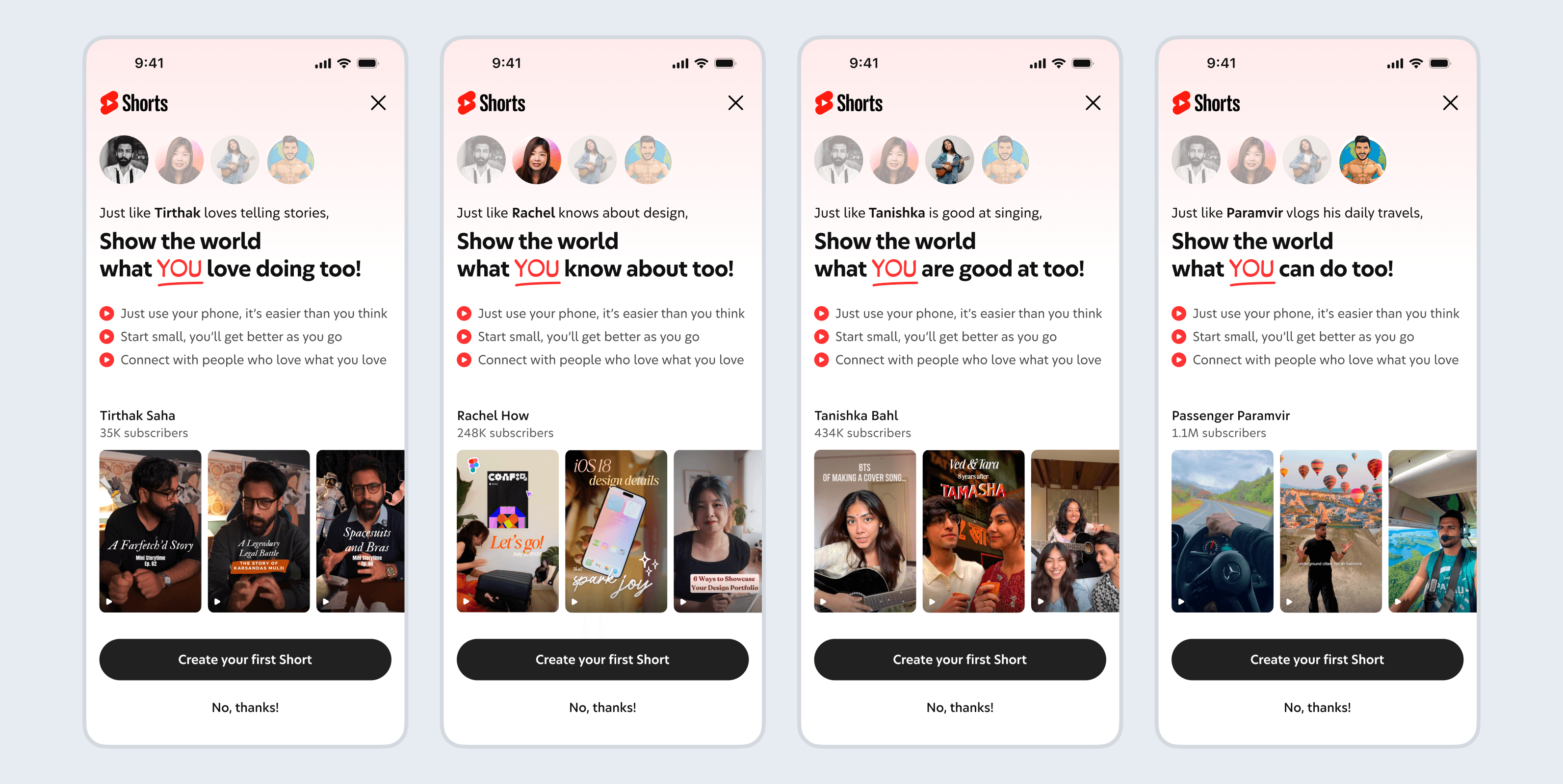
I quickly redesigned the screen based on the above points. Of course I don't have the data and the design hasn't been tested. Also, it does not look like YouTube—I'll have to see their upsell/pitch screens for that. All I can say is that it may fare better than that flash-bang earlier.

A list of 3 to 5 featured creators anchor the screen. The headline is coupled with the creator's story and a simple suggestion list—intended to ease the user in giving Shorts a try. The focus is on "you" and the featured creator is also chosen from the YouTubers "you" watch. The subscriber count below subtly reminds the user that the effort may be worthwhile.
The best thing: it's a timed carousel featuring different creators you follow.
Notes
We'll have to research the main reasons why users don't become creators. And we can try tackling the obstacles with the interface.
I wrote the pointers roughly. Ideally, they should be based in concrete data or research findings.
The design needs to be tested with other variations to see if it actually works, and make the needed changes.
The featured creators can be picked through user's watch history. In case no substantial match is found, the fallback could be a set of pre-determined creators (optional: can be based on region/language).
Finally, we can see four variations in the headline copy and a short story alongside the creator's name. There needs to be a system that assigns a creator to the appropriate copy and generates a short story for them. This may be technically challenging to implement.


