PRODUCT DESIGN
My Role
Scoping + Conceptualising
UX/UI Design
Information Architecture
Prototyping
Timeline
August 2023
People

Objective
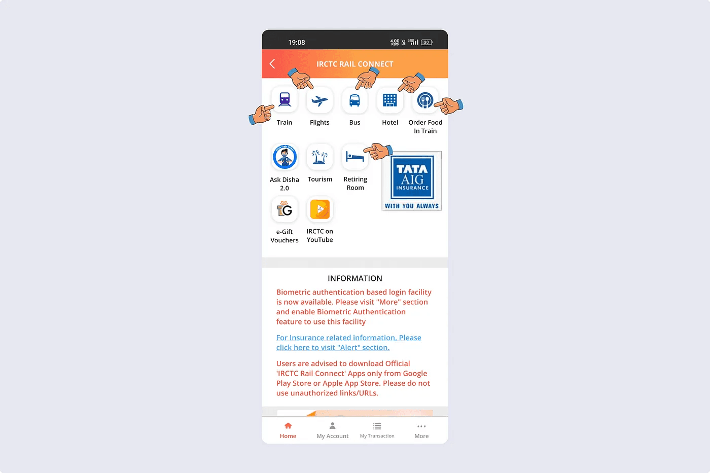
One. It was difficult to find what is intended on the screen since the information was too dense to consume at a glance.

Two. It was inconvenient to interact with the interface in the intended way. Users often bypassed steps by clicking the red CTA at the bottom, before being reminded to complete a ton of actions first.

Three. It was puzzling for most users to figure out what was happening. Most interactions felt unexpected and unreliable.

Little asking around also revealed some peripheral insights:
Younger users prefer using third-party apps for booking tickets, citing frequent crashing and poor usability as the main reasons.
Only a few people are aware that IRCTC offers other services in addition to ticketing and food-ordering.
Older participants who use the IRCTC app, have memorised the ticket booking flow. Some can’t even cancel those tickets!
Fix usability issues
Integrated design
Inclusivity

Disconnected experience


Segmented control to switch between different views
It is crucial to inform the user about all upcoming bookings and any immediate journeys they have to undertake, succinctly. Another objective was to get rid of all irrelevant data points to show plenty of entries on the viewport at a time. Auxiliary information should be presented on subsequent interactions.

Card information architecture iterations
Since it’s a lot of data points in a cramped space, many trade-offs regarding what information to display and prioritise were made.

User flow for adding external bookings

Users can verify a booking through an OTP
When user adds a new booking, their control is restricted — passenger information and destructive actions are hidden. They can track the live status of the train and receive all journey updates though.

Adding a booking experience

Journey details screen
Instead of just showing static booking data, the screen should focus on the whole journey — with real-time information alongside.

Updates centre and live running status
The updates centre at the top doubles down as a button to view the live running status of the train in detail.

Journey details screen
Since the interface is information-heavy and would serve as a starting point for multiple flows, it demands logical hierarchy and clear interaction gateways.

Journey details screen
The philosophy of designing for the whole journey also offers ancillary benefits like supporting inexperienced passengers and showcasing situational offers.

Interface at various stages of the journey
The interface also needs to convey a sense of urgency at critical junctures. This can be paired with notification alerts to help the user transition smoothly between various phases of their journey.

Cancellation module at different times after booking
The cancellation module is another component that changes form with time, ensuring that the user is fully aware of cancellation charges at all times after booking.

Close-up of the cancellation module

Contextual adverts on the journey details screen
Based on where the user is travelling, contextual promotional content can be shown to intrigue the user to increase inbound leads.

Booking screen — before and after
In order to find the right trains, only a handful of inputs are needed from the user. I designed the flow around these inputs, optimising for speed and efficiency.

Searching for trains — user flow
I designed slight conveniences to accelerate searching for trains and make the flow more efficient by alerting the user beforehand. I think that such a flow would be technically challenging to implement, but for the sake of this case study I have assumed its technical feasibility.

Searching for trains experience

Viewing trains
Once the users land on the search results, the information hierarchy has to make sense for them to make an informed decision. It took a lot of iterations to land on this design.

Coach class and date selection
The focus shifted from finding the right train to finding the right date.


Reviewing journey and paying
I designed a little delightful animation at the end to congratulate the user on booking the ticket. The completion screen would take the user to My Journeys where they can manage their booking.

Booking experience


